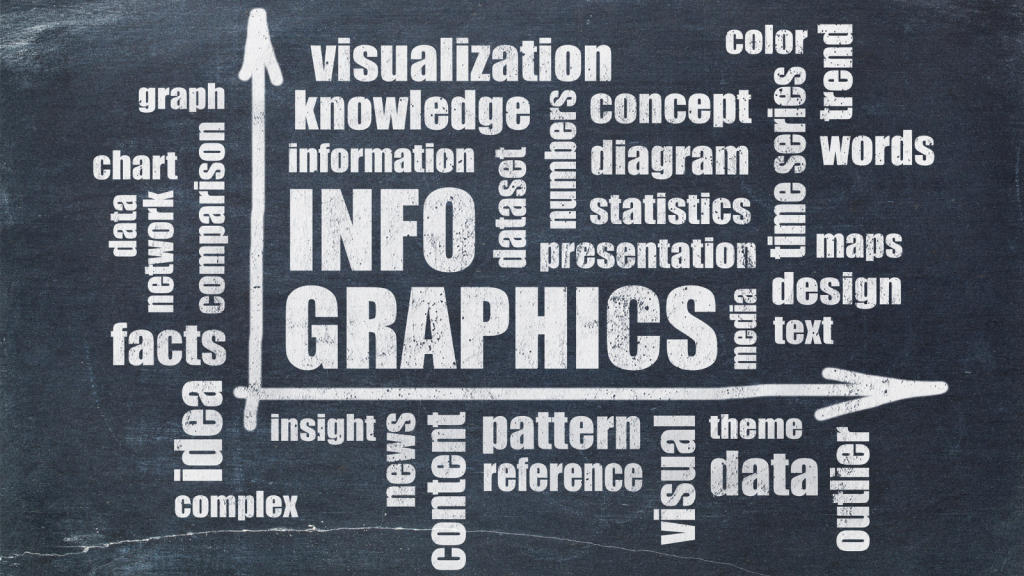
In the world of digital marketing, data is everything. As marketers, we rely heavily on metrics to understand our audience, refine our strategies, and drive better results. However, numbers on a spreadsheet can sometimes feel a little… dry, right? That’s where infographics come in. They turn those numbers into visually engaging, easy-to-understand stories that can transform your email marketing efforts.
In this article, we’ll explore the untold benefits of using email marketing infographics, highlighting key statistics and tips you can leverage for your campaigns. We’ll show you how to use infographics to bring your email marketing data to life and explain how NLP (Natural Language Processing) can help your infographics resonate with a broader audience.
Let’s jump in and explore how infographics can elevate your email marketing strategy!
1. Why Email Marketing Infographics Matter
Picture this: You’ve just received an email from a company you’ve never heard of. The email has an engaging subject line, but as you start reading the content, you’re overwhelmed by long paragraphs filled with numbers and data. It’s hard to keep your attention, and after a few sentences, you start scrolling for the unsubscribe button.
Now imagine the same email, but this time it’s accompanied by a well-designed infographic. The data is visually represented in colorful graphs, pie charts, and icons. Instead of feeling like a chore, the information becomes engaging, easy to digest, and, most importantly, actionable.
That’s the magic of infographics—they help communicate complex information in a format that’s both visually appealing and accessible. And in email marketing, they can be a game-changer.
In fact, according to a report by HubSpot, emails that include visual elements like infographics experience 10% higher engagement rates. This makes sense, right? People process visual content faster than text-based content, and infographics are designed to do just that—convey valuable information in a fraction of the time.
Tip: Always include some form of visual content, like infographics, in your email campaigns. Not only do they improve engagement, but they also make it easier for readers to absorb key information.
2. Leveraging Email Marketing Statistics with Infographics
Now that we know why infographics are valuable, let’s take a look at how they can help you visualize key email marketing statistics. Here are a few statistics you can showcase with infographics to strengthen your campaign:
-
Open Rates: According to Mailchimp, the average open rate for email campaigns across all industries is around 21%. But this number can vary widely depending on your industry, audience, and approach. For example, nonprofit organizations often see higher open rates, while e-commerce campaigns tend to have lower open rates.
By creating an infographic that visualizes these numbers—such as comparing the average open rates for different industries—you can help your audience better understand the potential of email marketing. You could even include tips to improve open rates, such as optimizing subject lines, using segmentation, or testing send times.
-
Click-Through Rates (CTR): Another statistic that infographics can bring to life is the click-through rate (CTR). The average CTR for email campaigns across industries is about 2-5%, but again, this varies. By presenting this data in an infographic, you can also share actionable tips for improving CTR, such as using clear calls-to-action (CTAs), making content scannable, and adding compelling visuals (like images or buttons).
-
Conversion Rates: Conversion rates in email marketing are key to determining how well your email campaign is performing. A well-designed infographic that shows the correlation between open rates, click-through rates, and conversion rates can make this concept easier to grasp. You can also offer tips on how to improve conversion rates, such as personalization, A/B testing, and adding urgency (e.g., limited-time offers).
-
Mobile Opens: Did you know that over 50% of email opens happen on mobile devices? Creating an infographic that illustrates this trend, paired with advice on optimizing your emails for mobile, can be incredibly useful. For example, you might include tips on using responsive design, keeping subject lines short, and ensuring that CTAs are thumb-friendly.
By using infographics to present these statistics, you’ll not only make the numbers more digestible but also help your audience understand how they can apply them to their own campaigns.
Tip: Infographics are perfect for illustrating email marketing statistics. By presenting these numbers visually, you’ll help your audience quickly understand important trends and improve their own email strategies.
3. Creative Tips for Designing Your Own Email Marketing Infographics
Now that we know why infographics matter and how they can highlight key email marketing stats, let’s talk about the design process. You don’t need to be a professional designer to create compelling infographics. With the right tools and some creativity, you can easily turn your email marketing data into a visual masterpiece.
Let’s take a look at a few tips:
1. Start with a Story
Imagine you’re part of “FreshMarket,” a grocery delivery service that just launched a new subscription plan. Instead of simply sending out an email with a list of statistics, create an infographic that tells a story. You could start with a stat about the rise of online grocery shopping, followed by data on how many people now prefer home delivery. Then, lead into your subscription offer and include a call-to-action (CTA) at the end.
By structuring your infographic as a narrative, you create a sense of progression, helping the reader follow along and stay engaged. Infographics aren’t just about showcasing data—they’re about telling a compelling story that resonates with your audience.
2. Use Bold, Simple Design Elements
When designing your infographic, keep it clean, bold, and easy to follow. Stick to a color palette that aligns with your brand and avoid cluttering the graphic with too much text. The goal is for the reader to process the information in a glance, so simplicity is key.
For example, if you’re showing email open rates, use a large pie chart with sections that clearly illustrate the percentages. Use different colors to represent each section (e.g., blue for “average open rate,” green for “industry-specific open rate”) to make it easy for the reader to differentiate between the data points.
Tip: Focus on simplicity and clarity. Use bold colors and simple icons to help readers quickly understand the message you’re conveying.
3. Add NLP to Your Design
Let’s say you’ve designed a stunning infographic that highlights the benefits of email marketing, including tips on subject lines, personalization, and segmentation. How do you make sure this infographic resonates deeply with your audience?
This is where NLP comes in. By using natural language in your infographic copy, you can connect with readers on a more emotional level. Instead of writing generic advice like, “Use personalization,” you could say, “Make them feel seen: Personalize your emails with their name.” By framing tips in a conversational, relatable tone, you make the advice feel more human and approachable.
For instance, a piece of advice on segmentation might say, “Don’t send a one-size-fits-all email. Create tailored messages that speak directly to your subscribers’ needs.” This makes the content feel more actionable and relatable.
Tip: Use NLP to enhance the tone of your infographic. Make your messaging conversational, friendly, and relatable to increase engagement and connection with your audience.
4. Repurposing Infographics Across Channels
Now that you’ve created an eye-catching infographic for your email campaign, why not use it across other marketing channels? Infographics are highly shareable, making them ideal for social media platforms like Instagram, LinkedIn, and Pinterest.
Let’s imagine “GreenSprout,” a sustainable garden supply brand. They’ve just launched an email campaign featuring an infographic on how to start a home garden. The email includes helpful tips and stats about the benefits of home gardening. Instead of stopping there, they share the same infographic on Instagram, accompanied by a caption that encourages followers to start their own garden.
By repurposing your infographics, you can reach new audiences on different platforms, driving even more engagement and conversions.
Tip: Repurpose your email marketing infographics for use on other platforms. They’re great for social media, blogs, and even as downloadable resources on your website.