Let me take you into a scene.
Maya, a mindset coach, was prepping her first-ever free webinar: “Break Mental Blocks in 7 Days.” She had passion. She had knowledge. She even had a killer Zoom link.
But when she posted about it on Facebook and Instagram… crickets.
A few likes. One “interested” click. Zero sign-ups.
She wasn’t missing content. She was missing conversion-driven design.
In this article, we’ll dive deep into the world of social media design for webinars, revealing advanced, untold tips that go far beyond slapping a photo with some text. We’ll even sneak in a bit of NLP (Neuro-Linguistic Programming) to make your visuals speak directly to your audience’s subconscious.
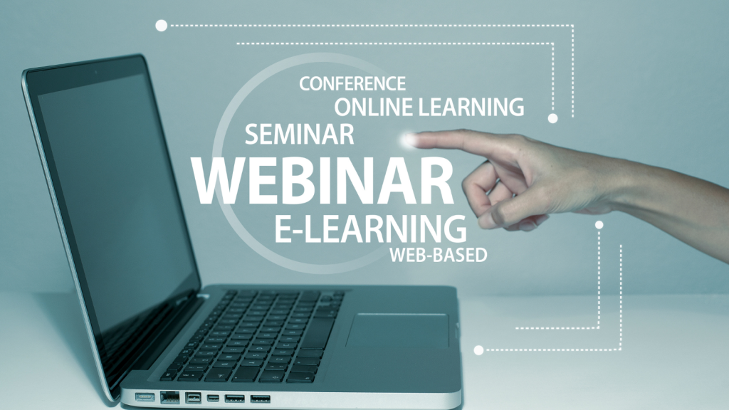
Why Design Matters More Than Ever for Webinars
Webinars live in a crowded space. Every day, your audience scrolls past:
-
3-second recipe reels
-
Loud infographics
-
Sparkly carousel promos
-
That “one weird trick” ad again…
Your design needs to interrupt the scroll, hold the eye, and anchor the decision to sign up—in under 2 seconds.
That’s not a job for Canva templates alone. That’s visual psychology and emotional strategy working together.
Strategy #1: Design Like a Landing Page, Not a Poster
Maya’s first mistake? She made a graphic that looked like a seminar flyer from 2009:
-
Big block of text
-
Her headshot in the corner
-
The word “FREE” in neon red
It didn’t feel digital or dynamic.
So what did we do?
We treated the graphic like a mini landing page, with clear sections:
-
Hook headline (at the top)
-
Emotional benefit (center focus)
-
Urgent CTA (bottom or as a button element)
️ Before:
“Break Mental Blocks | Free Webinar | 7PM EST”
✅ After:
“Stuck in Overthinking Mode?”
Free 1-hour training to finally move forward.
Save Your Spot Now
Why it worked: It stopped talking about the webinar and started talking to the viewer’s problem.
Strategy #2: NLP Visual Anchoring
Here’s an untold trick: our brains process images 60,000x faster than words.
So if you’re designing for a mindset, finance, fitness, or business webinar—use visual symbols that mirror internal struggles or goals.
Examples:
-
Mindset webinar? Use fog, a maze, or a sunrise breaking through clouds.
-
Productivity session? Show scattered papers transforming into tidy checklists.
-
Business growth class? Use upward arrows, graphs, or blurred crowds sharpening into focus.
NLP Tip:
Use metaphors that represent transformation. Your design should show the feeling of change, not just talk about it.
Strategy #3: Motion > Static (Even Slightly)
In 2025, Instagram and Facebook prioritize motion.
That doesn’t mean you need cinematic videos—just subtle movement.
For example:
-
A glowing “Join Free” button pulsing gently
-
The headline text typing out letter-by-letter
-
A clock hand ticking subtly in the corner
These micro-animations hack the “pattern interruption” mechanism in the brain.
Pro Tip: Export your Canva designs as short MP4s with 3–5 seconds of subtle animation. Upload to Reels, Stories, or LinkedIn Posts.
Strategy #4: Social Proof Embedded in Design
Here’s what Maya added to her next webinar graphic:
✅ 3,800+ students
⭐ 4.9 rating on TrustPilot
“Game-changing insights!” – Rehana A.
We designed these into a badge-style cluster beside her photo. It made her visual more trustworthy without reading the caption.
Design Hack: Use testimonial bubbles or star ratings as part of your core image, not as secondary copy.
NLP layer: The brain unconsciously associates symbols like stars, check marks, and numbers with credibility and reputation.
️ Strategy #5: Countdown & Time Anchors
Static posts don’t show time pressure—so create it through design.
Add:
-
“Seats filling up fast…” banners
-
“Starts in 48 hours!” badges
-
Countdown stickers in stories
-
“One-time-only” stamps
Use colors that trigger urgency:
-
Red = alert
-
Yellow = scarcity
-
Orange = limited-time excitement
NLP Tip: Use embedded time language like:
“You’re just one hour away from changing your perspective.”
That anchors transformation to a short, achievable timeframe, lowering internal resistance.
Strategy #6: Design for the Funnel Stage
Design shouldn’t just sell the registration. It should support every stage of your webinar funnel.
Here’s how Maya structured her visuals across touchpoints:
| Funnel Stage | Visual Purpose | Design Elements |
|---|---|---|
| Awareness | Spark interest | Curiosity headline + dynamic background |
| Consideration | Build authority | Headshot + testimonials + benefit bullets |
| Decision | Drive urgency | Countdown, offer banners, “Swipe Up to Register” |
| Reminder | Confirm attendance | “You’re in! See you tonight at 7PM EST” graphics |
| Post-Webinar Followup | Nurture conversion | “What You Missed” recap with key takeaways slide |
Bonus: AI-Based Personalization Layer
Here’s an advanced trick few use:
If you’re running paid ads to your webinar registration, use dynamic creatives to test different visuals based on persona segments.
Example:
-
Show career coaching visuals to 30–40 yr olds with a corporate background
-
Use entrepreneurial symbols (MacBooks, coffee, city skyline) for startup founders
-
Swap testimonial visuals to match the audience gender or location
Facebook Dynamic Creative Tools or Canva’s Smart Resize + AI Visual Matching features can help with this.
Final Thought: Don’t Just Design—Persuade Visually
Your social media designs are mini psychological billboards.
They’re not there to “look good.” They’re there to:
-
Stop the scroll
-
Spark emotional relevance
-
Anchor transformation
-
Drive instant, easy action
Just like Maya discovered, it’s not about stuffing your slide with info. It’s about saying one powerful thing, visually, to the right person at the right time.