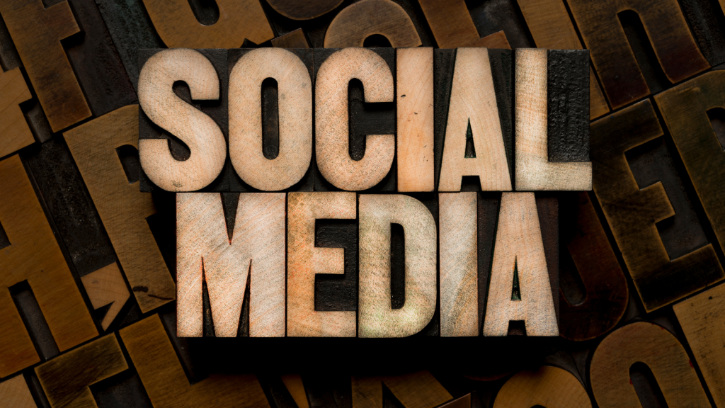
Social media headers are like the billboards of your online presence—they’re the first thing people see when they visit your profile. And when it comes to events, whether it’s a music festival, a business conference, or a charity fundraiser, your header can make or break engagement.
But here’s the problem: Most event headers look the same. A generic background, some bold text, and a logo slapped in the corner. Yawn.
What if I told you there’s a smarter way to design event headers—one that grabs attention, boosts engagement, and even uses NLP (Neuro-Linguistic Programming) techniques to make your event irresistible?
Let’s dive in.
Why Your Event Header Needs a Strategy
Imagine this:
Sarah is scrolling through Twitter when she sees a post about an upcoming tech conference. The event sounds interesting, so she clicks the organizer’s profile. The header is a blurry stock photo with tiny, unreadable text. She hesitates—does this event look professional? She closes the tab.
Now, imagine another scenario:
Mike sees a tweet about a gaming expo. He clicks the profile and finds a dynamic, animated header with bold colors, a countdown timer, and a clear call-to-action: “Early Bird Tickets Selling Fast!” His brain instantly registers urgency and excitement. He clicks the link.
Which event do you think gets more sign-ups?
Untold Tips for High-Converting Event Headers
1. Use NLP Triggers in Your Design
NLP (Neuro-Linguistic Programming) is all about influencing perception through language and visuals. Here’s how to apply it:
-
Power Words: Use words like “Exclusive,” “Limited,” “Now,” or “Don’t Miss Out”—they create urgency.
-
Color Psychology:
-
Red = Urgency & excitement
-
Blue = Trust & professionalism
-
Green = Growth & positivity (great for eco-friendly events)
-
-
Faces & Eye Direction: If you include people in your header, have them looking toward your event details. Our brains naturally follow gaze direction.
2. Make It Platform-Specific
Each social media platform has different header dimensions. A LinkedIn header won’t work the same as a Twitter or Facebook one.
-
Twitter/X Header: 1500x500px (Key info should be centered—mobile users often miss edges.)
-
Facebook Cover Photo: 820x312px (Leave space for profile picture overlap.)
-
LinkedIn Banner: 1584x396px (Ideal for professional events—keep it clean.)
Pro Tip: Use Canva or Adobe Spark for easy resizing.
3. Dynamic Headers (The Secret Hack)
Most people use static images, but animated headers get 3x more engagement.
-
GIF Headers: A subtle animation (like flickering lights or a moving countdown) grabs attention.
-
Video Headers (Facebook): Upload a short clip showcasing event highlights.
Example: A food festival uses a looping GIF of sizzling dishes—immediate hunger trigger!
4. Hidden Call-to-Action (CTA) Placement
Don’t just write “Register Now” in huge letters. Instead:
-
Place the CTA where eyes naturally go—top center or slightly right (studies show we scan headers in an “F” pattern).
-
Use arrows or visual cues pointing toward the event link in your bio.
5. Test Different Versions
Run A/B tests with different headers a week before the event. Track which one gets more profile visits.
-
Version A: Bold text + bright colors
-
Version B: Dark background + glowing neon effect
See what sticks.
Real-World Example: A Concert That Sold Out in 24 Hours
A local band was struggling to sell tickets for their gig. They changed their Facebook header to:
-
A dark theme with neon text (“LAST CHANCE: 50 Tickets Left!”)
-
A hidden CTA arrow pointing to the bio
-
A moving spotlight effect (subtle GIF)
Result? Sold out in a day. Why? Because the header triggered FOMO (Fear of Missing Out).
Final Thought: Your Header is a Silent Salesman
Your event’s social media header isn’t just decoration—it’s a 24/7 promoter. By using NLP techniques, dynamic visuals, and strategic CTAs, you can turn passive scrollers into eager attendees.
So next time you design a header, ask yourself:
-
Does this create urgency?
-
Does it guide the eye where I want it?
-
Would I stop scrolling for this?
If yes, you’re on the right track. Now go make that header unforgettable!