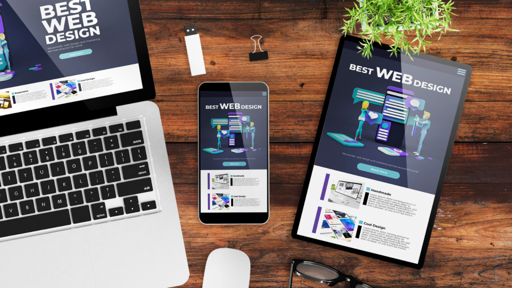
Have you ever spent hours crafting the perfect social media post on your desktop, only to check it on your phone and realize—oops—it looks all wrong? Welcome to the world of mobile-first design.
With over 80% of social media users browsing on mobile devices, designing for mobile isn’t optional—it’s essential. But here’s the thing: most people just resize their designs and call it a day. If you really want your content to stand out, you need to think beyond just shrinking images and make strategic design choices. Here are some untold tips and tricks to make your social media content shine on mobile screens.
1. Start With Mobile in Mind, Always
Imagine designing a poster for a massive billboard and then trying to shrink it down to a business card. That’s what happens when you design on a desktop first and then resize for mobile—it just doesn’t work as well.
Instead, start designing for the smallest screen first. Think about how your content will look in a vertical format, where your text will sit, and whether key elements remain clear and readable. Then, if needed, scale up for larger screens.
2. Use NLP-Based Copy That Feels Personal and Engaging
A huge part of designing for mobile isn’t just about visuals—it’s about the words you choose. Social media algorithms love conversational, natural-sounding copy that mirrors the way people think.
Instead of: “Limited-time offer available now! Get yours today!”
Try this: “Ever wished you could get this for less? Now’s your chance! But hurry!”
By structuring captions in a way that mirrors how people naturally read and think, you create a connection that boosts engagement.
3. Optimize for the Thumb Zone
People don’t interact with their phones the same way they do with desktops. Most users hold their phones in one hand and navigate with their thumbs. The “thumb zone” is the area that’s easiest to reach.
Place key interactive elements—like call-to-action buttons—within easy thumb reach. That means keeping important buttons towards the lower half of the screen rather than at the very top where users might struggle to tap them easily.
4. Keep Text Big and Bold
Have you ever squinted at a post trying to read tiny text? If people have to zoom in, you’ve already lost them.
For mobile:
- Stick to larger, bold fonts that stand out.
- Use concise messaging—short, impactful words work better than long paragraphs.
- Keep important text above the fold so users don’t have to scroll to find the message.
5. Leverage Vertical Formats
The days of horizontal videos dominating social media are over. With platforms like TikTok, Instagram Stories, and YouTube Shorts exploding in popularity, vertical content is king.
If you’re creating videos or graphics, design them in a 9:16 aspect ratio so they take up the full screen. This maximizes impact and reduces distractions from other content.
6. Use High-Contrast Colors for Visibility
Bright, high-contrast colors help ensure your text and visuals pop against different backgrounds. Think about how your content will look in both light and dark mode, since many mobile users prefer dark mode for browsing.
Use:
- Contrasting backgrounds and text (e.g., white text on dark backgrounds, dark text on light backgrounds)
- Simple, bold color palettes to avoid visual clutter
- Brand colors strategically so your content is instantly recognizable
7. Make Motion Work for You, Not Against You
GIFs, animations, and motion effects can grab attention, but they can also overwhelm users if not used properly. On mobile:
- Keep animations short and subtle—quick movements work better than long, drawn-out transitions.
- Ensure text animations aren’t too fast—people should be able to read them at a glance.
- Use movement to guide the eye—animate key elements to direct attention where you want it.
8. Design with One-Hand Scrolling in Mind
Picture this: You’re holding your phone in one hand and a coffee in the other. If a post requires too much interaction—pinching, zooming, or excessive tapping—you’ll probably just scroll past it.
Mobile design should be effortless to navigate:
- Avoid tiny clickable areas—buttons should be at least 44px in height for easy tapping.
- Make links and CTAs stand out—don’t bury them in long captions.
- If using carousel posts, make swiping smooth and intuitive.
9. Optimize Load Speed for Faster Engagement
Slow-loading content is the ultimate buzzkill. If your post or ad takes too long to appear, users will move on.
To keep things fast:
- Compress images without sacrificing quality.
- Use lightweight file formats like WebP instead of PNG.
- Minimize unnecessary elements—too many effects and layers can slow things down.
10. Test, Test, and Test Again
Even the best-designed mobile content can fail if it doesn’t display properly on different devices. Before posting, test your designs:
- View them on multiple phone sizes.
- Check how they look in both light and dark mode.
- Tap on interactive elements to make sure they work smoothly.
If something looks off, tweak and refine before publishing.
Final Thoughts
Designing for mobile isn’t just about resizing images—it’s about understanding how people use their phones and crafting content that feels natural, engaging, and easy to interact with.
By optimizing for the thumb zone, using NLP-powered conversational copy, leveraging vertical formats, and keeping designs simple yet bold, you can create social media content that stops the scroll and gets noticed.
So next time you sit down to create a post, ask yourself: How will this look and feel on mobile? That one question can be the difference between a post that gets lost in the feed and one that truly stands out.