Imagine this: You click on an ad that promises “50% Off the Best Running Shoes.” Excited, you land on a webpage only to find a cluttered, confusing design with no mention of the 50% discount. Frustrated, you close the tab and move on.
Now, flip the script. Imagine clicking that same ad but landing on a sleek, well-designed page that immediately reassures you: “Limited-Time Offer: 50% Off All Running Shoes – Order Now.” A clear call to action, stunning visuals, and an easy checkout process. You buy without hesitation.
This scenario reveals the untold truth of PPC advertising: Your ad is only as good as your landing page.
Many marketers pour thousands into Pay-Per-Click (PPC) campaigns, expecting massive results, only to be disappointed when conversions don’t follow. The problem? A poorly optimized landing page that doesn’t align with the ad’s promise.
In this guide, we’ll uncover how PPC and landing page design work together, share hidden tricks that top marketers use, and teach you how to design pages that convert clicks into customers.
Why PPC Ads and Landing Pages Must Work Together
Think of PPC ads and landing pages as a tag team. The ad captures attention, but it’s the landing page that closes the deal.
Here’s where most businesses go wrong:
Mismatch Between Ad and Landing Page – If your ad promotes “Free Shipping,” but your landing page doesn’t mention it, visitors lose trust and leave.
Too Many Distractions – Landing pages cluttered with menus, pop-ups, and irrelevant offers confuse visitors, making them bounce instead of converting.
Slow Load Speed – If your page takes longer than 3 seconds to load, more than 50% of visitors leave instantly.
Weak Call-to-Action (CTA) – If your CTA is vague like “Learn More”, visitors won’t feel an urgency to act.
✅ Winning Formula? Message Match + Speed + Clarity = Higher Conversions.
Let’s explore how to nail each of these elements.
Step 1: Crafting a High-Converting PPC Ad
Before designing the perfect landing page, you need an effective PPC ad.
A high-converting ad has:
✔ A Compelling Headline – “Get 40% Off Today Only!” grabs attention.
✔ Emotional Triggers – Use FOMO (Fear of Missing Out), scarcity, or urgency.
✔ A Clear CTA – “Shop Now” or “Claim Your Discount” is direct and actionable.
✔ Relevant Keywords – Ensure your ad is optimized for search intent.
Example: PPC Ad for a Fitness App
Google Ad:
“Burn Fat Fast! Try Our 30-Day Free Workout Plan”
“Join 50,000+ People Getting in Shape – No Credit Card Needed!”
[Start Free Trial]
Now, let’s design a landing page that ensures these clicks turn into sign-ups.
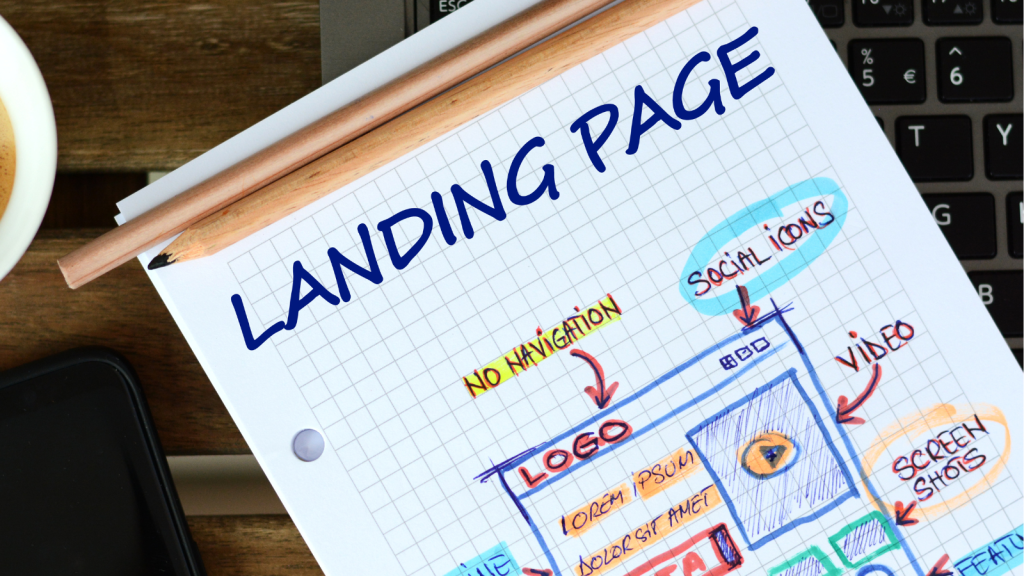
Step 2: Designing a PPC-Friendly Landing Page
A great landing page isn’t just about looking good—it needs to be a conversion machine.
1. Headline & Subheadline: Instant Clarity
Your headline should immediately confirm that visitors are in the right place.
✅ Bad Example:
“Welcome to Our Site” (Too vague, doesn’t align with the ad.)
✅ Good Example:
“Start Your Free 30-Day Workout Plan – No Credit Card Required!”
Pro Tip: Use Neuro-Linguistic Programming (NLP) to make your headline persuasive. Words like “Proven,” “Exclusive,” “Effortless,” and “Guaranteed” trigger action.
2. Strong Visual Hierarchy: Make It Skimmable
80% of visitors won’t read your page in detail—they scan. Make sure they get the message in seconds.
Use Large, Bold Headlines
Break Content into Short Sections
Use High-Quality, Relevant Images
Example:
️ Fitness App Landing Page
✔ Large hero image of a happy, fit person
✔ “Join 50,000+ Users in Transforming Their Health” – clear benefit statement
✔ Call-to-action button above the fold
3. Load Speed: The Silent Conversion Killer
Did you know? A 1-second delay in page load time reduces conversions by 7%.
How to Improve Page Speed:
✅ Use fast hosting
✅ Compress images and videos
✅ Minimize JavaScript & animations
Test your page speed with Google PageSpeed Insights.4. Keep Forms Short and Sweet
People hate long sign-up forms. The fewer fields, the higher the conversion rate.
Bad Example:
Name, Email, Phone, Address, Company, Job Title, Zip Code, Age, Gender
✅ Good Example:
Name + Email + “Sign Me Up”
Pro Tip: Use auto-fill options to make forms even easier.
5. Optimize Your CTA for Action
Your Call-to-Action (CTA) button should stand out and tell users exactly what to do.
CTA Button Formula = Action Verb + Benefit
✅ Weak: “Submit”
✅ Better: “Claim Your Free Trial”
✅ Best: “Start Your Free 30-Day Workout Now”
Pro Tip: Use contrasting colors for your CTA. If your page is blue, use a bright orange or green button to make it pop.
Step 3: Retargeting and Post-Click Optimization
Not everyone will convert on the first visit. That’s where retargeting comes in.
How to Bring Back Visitors Who Didn’t Convert
Facebook & Google Retargeting Ads – Show ads to past visitors with a “Come Back & Claim Your Discount” message.
Email Follow-Ups – If they entered their email but didn’t sign up, send a reminder email with urgency.
Exit-Intent Popups – If they try to leave, show a “Wait! Get 10% Off Now” popup.